Revolutionizing Restaurant
Discovery with Chompster
I immersed myself in the user experience to uncover key research features and bring them into one intuitive platform.

Role
UX/UI Designer
Duration
3 Weeks (2024)
Team
1 UX/UI Designer
Tools
Figma, Procreate, Chat GPT
Research Methods
User Interviews, Insight Synthesis, Affinity Mapping, Persona Creation, Competitive Analysis, Storyboarding, Heuristic Evaluation, Usability Testing, Information Architecture, Decision Flow Diagrams, Wireframing, Prototyping, Interaction Design, Visual Design
Project Overview
Chompster is a curated mobile search engine app designed to simplify restaurant research for adventurous food lovers who enjoy exploring new dining experiences with friends. This project aimed to address the frustration caused by disorganized and inaccurate information on dining options.
The Problem
Finding accurate, comprehensive information about restaurants in one place can be surprisingly hard.
For adventurous food lovers, the excitement of discovering new places can quickly fade when faced with the time-consuming task of verifying if a restaurant is truly worth the visit.
Instead of being fun, the process can feel more like a chore than an adventure.
Empathize
To reveal what specific challenges food enthusiasts face during the restaurant research process, I synthesized data from five user interviews, exploring their goals, needs, and pain points.
To deepen my understanding, I paired this with a competitor analysis, pinpointing what other industry leaders are doing well and what can be improved upon.
This research laid the groundwork for creating a more intuitive and empowering experience for users.
Here are the user challenges we discovered:
01
Wasting
Money
Users are often uncertain about whether they'll enjoy the food at a new restaurant, leading to hesitation when choosing unfamiliar dining options.
02
Overwhelming
Information
Users feel overwhelmed by the abundance of options when researching dining choices in a specific area, making it challenging to find the ideal spot.
03
Poor Filtering
System
Users feel that current filters for food research lack the specificity needed to match their unique preferences, making it difficult to find precisely what they're looking for.
How might we simplify the food research process so adventurous food lovers can quickly discover options that match their unique needs?
Ideate
Inspired by my users' challenges, I invited two talented UX/UI designers to brainstorm innovative features for my mobile app.
Our session buzzed with creativity as we discussed what users liked about current processes and what could be improved. This sparked ambitious ideas, each aimed at enhancing the user experience.
We grouped similar concepts and voted on the ones that offered the most user and business value. Ultimately, we focused on identifying the foundational feature that would enable the others, ensuring our creativity was purposeful in addressing user needs.
We believe a curated search engine for restaurants for adventurous food enthusiasts will achieve an increased quality of life by making their food research process easier with streamlined information.
To illustrate how the search engine feature on the app would be used I created a storyboard to visually outline the sequence of events, actions, and interactions that the user goes through when engaging with Chompster, building better understanding of the context.

Prototype
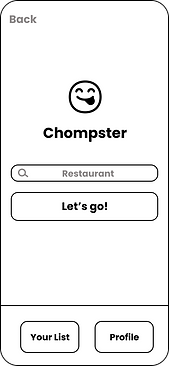
I created a lo-fi prototype for quick user testing. The goal was to see if my design choices were justified by target users. You can test it out here.


Test & Iterate
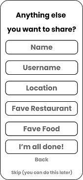
I tested my user flows with a focus on overall user journey experience from a curated onboarding experience to choosing their desired restaurant option. The updates made to the prototype came down to simplifying the process and lowering the scale of features due to time constraints. You can see all the changes made here.


Changed the long form into a simple multi-step form.


Removed complex personalization to simplify the user journey.
Final Design
Chompster, a curated search engine for restaurants, increases adventurous food enthusiasts' quality of life by making the food research process easier with streamlined information.
You can explore the high-fidelity prototype here.


Next Steps
With a timeline of about 4 weeks, I created a good foundation for a food research app, but wanted to execute more to make Chompster stand out from the competitors that I analyzed.
Here are a few steps I would recommend to further engage users:
01
Social Media Integration
Social media integration would enhance restaurant discovery and community engagement. Real-time photos and videos from platforms like Instagram and TikTok would showcase authentic visuals of dishes and ambiance, giving users a firsthand look at restaurant offerings.
02
Comprehensive Restaurant Information
Include more information about the restaurant such as menu, address, contact information, reservations. Once built a larger user base, a feature to write and view detailed reviews to build credibility, also integrated from Google Maps and Yelp to ensure users get everything they need from one place.
Final Takeaways
This was a very exciting passion project as I have had this app idea in mind for a long time prior to this project. It helped me understand what the UX process really entails, and I learned a lot throughout it.
01
The Design Process Isn’t Linear
Although I was learned about the design process prior to the project, actually executing the design process was an experience filled with trial and error. When making iterations to one element of the app, such as the mid-fidelity clickable prototype, the task flow and user flow also needed to be iterated. This process was repeated multiple times.
02
Feedback is Essential
In depth user interviews and user testing provided the data needed to create a better user experience. As an individual, you cannot foresee all the potential pain points for your user. Getting feedback from fellow UX designers helped me see my project from a different lens to help me see the bigger picture.
03
Teamwork Fuels Great Ideas
The ideation phase can be challenging when you get creative block. However, hearing other UX designer’s ideas during our brainstorm session gave me a lot of inspiration for more features that I wouldn’t have thought of without their input. After reflecting on our brainstorm session, more ideas continued to develop.

